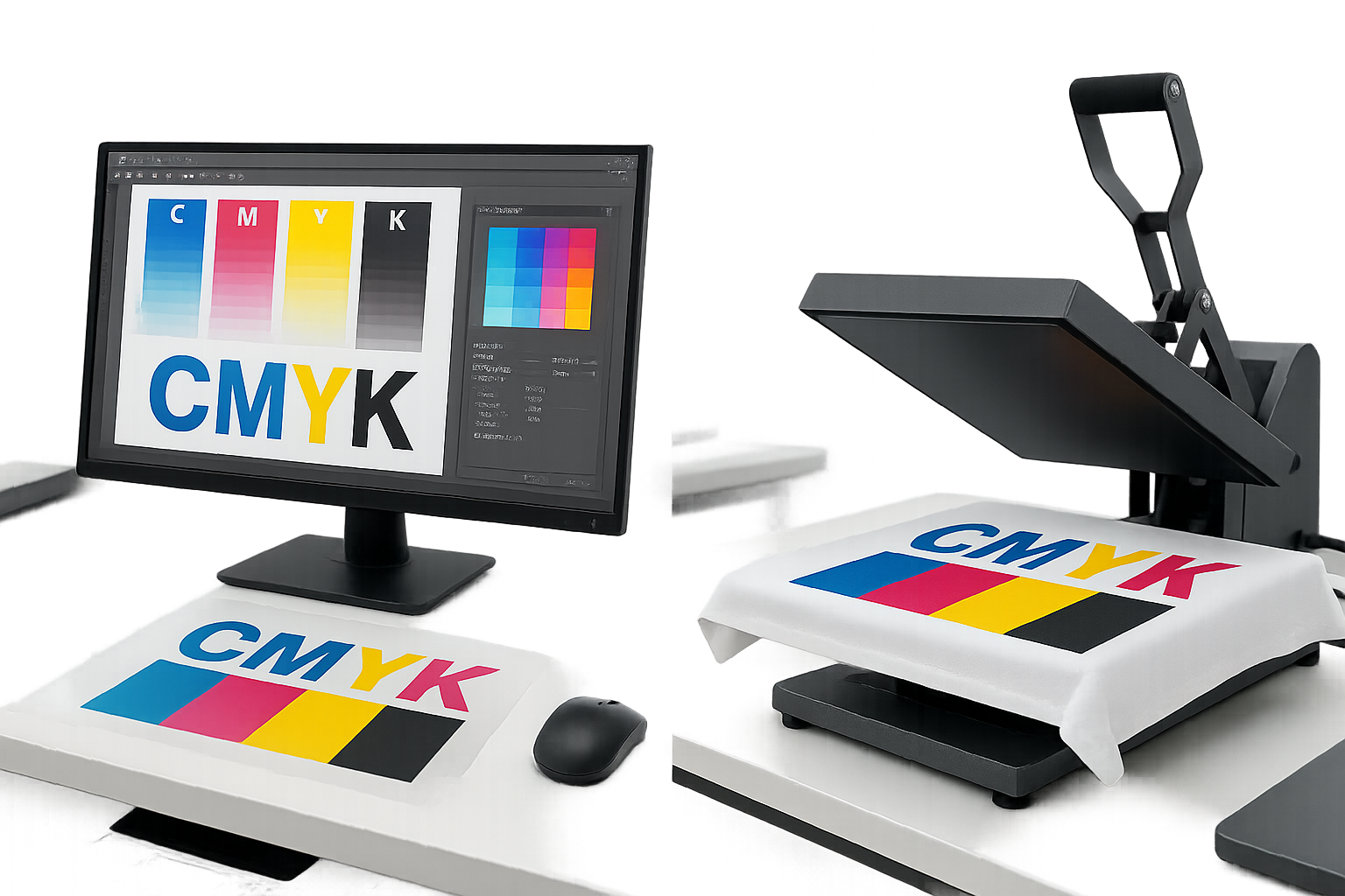
Maximize Vibrancy, Accuracy, and Ink Efficiency in Every Print
Color is everything in DTF (Direct to Film) printing. Whether you’re producing custom apparel, promotional products, or retail-ready merchandise, your customers expect prints that are vivid, consistent, and true to design.
But color management in DTF printing isn’t as simple as hitting “print.” From design setup to RIP configuration and ink control, optimizing your color usage can mean the difference between a stunning, professional-quality print—and a faded disappointment.
In this blog, we’ll show you exactly how to optimize color usage in DTF printing to achieve maximum vibrancy, accuracy, and cost efficiency.
Why Color Optimization Matters in DTF Printing
Here’s what proper color optimization impacts:
- 🎨 Color Accuracy: Match the original design without oversaturation or unwanted tones.
- 💰 Ink Efficiency: Use just the right amount of ink—no waste, no overprinting.
- 👕 Print Durability: Excess ink can crack or peel; proper usage improves longevity.
- 🔁 Consistency: Maintain the same tones across batches and fabric types.
Start with High-Quality, CMYK-Ready Designs
Optimizing color begins before the printing process—in your design files.
Best Practices:
- Use 300 DPI resolution for sharp detail.
- Always work in CMYK mode (not RGB). RGB colors may not translate well to pigment inks.
- Avoid relying on neon or metallics unless you have specialty inks.
- Use vector graphics for clean, scalable color shapes.
🎨 Tip: If your design includes blacks, use “rich black” (e.g., C60 M40 Y40 K100) instead of 100% K for smoother tones.
Use a Reliable RIP Software for Color Management
RIP (Raster Image Processor) software is the brain behind your print output. It controls ink laydown, white underbase coverage, and color calibration.
Key Settings to Check:
- White Underbase Layer: Ensure it’s strong enough for dark garments, but not too thick to cause stiffness or cracking.
- Ink Limits: Set maximum ink levels to prevent oversaturation.
- Color Profiles (ICC): Load accurate ICC profiles for your printer, film, and ink combination.
🛠 Tip: Run color swatch tests to preview how colors actually print. Calibrate profiles as needed.
Optimize the White Ink Layer
White ink in DTF printing serves as the foundation that makes colors pop on dark or colored fabrics—but it’s easy to overuse.
How to Fine-Tune:
- Use just enough white to support color vibrancy, not drown it.
- Adjust white ink coverage in your RIP software—typically 70–90% is ideal.
- On light garments, consider reducing or removing white underbase to save ink.
🧪 Test different percentages of white ink on various fabric types to find your sweet spot.
Calibrate Your Monitor for Accurate Proofing
If your screen doesn’t display colors accurately, you’re making decisions based on the wrong data.
Fix It By:
- Using a color calibration tool (e.g., Datacolor Spyder or X-Rite).
- Setting your monitor to 6500K temperature and 120 cd/m² brightness.
- Designing in a space with consistent lighting (avoid bright windows or warm bulbs).
💡 Even the best ICC profile can’t fix an uncalibrated screen.
Maintain Your Printer for Consistent Ink Flow
Even perfect files won’t print well with clogged nozzles or dirty print heads.
Maintenance Tips:
- Shake white ink cartridges daily to prevent sediment.
- Perform nozzle checks and cleanings before print runs.
- Use OEM or high-quality compatible inks to avoid color shifts.
🧼 Poor maintenance leads to banding, color loss, and unexpected tone shifts.
Use High-Quality PET Films and Inks
Color vibrancy relies heavily on the materials you use. Cheap film or low-grade inks will mute your results no matter how well your file is prepared.
Look For:
- PET films with double-side coating and anti-static treatment.
- Pigment-based DTF inks that offer full CMYK + white.
- Compatibility between your film, ink, and printer model.
🏷️ Cheaper materials may save money upfront but cost you in poor-quality output.
Adjust Ink Density for Fabric Type
Not all fabrics absorb or reflect ink the same way. Ink density settings should vary based on material.
| Fabric Type | Suggested Ink Density |
| 100% Cotton | High (80–100%) |
| Polyester | Medium (60–80%) |
| Blends | Medium-High (70–90%) |
| Nylon | Test (varies) |
🧵 Run test prints when switching fabric types to prevent color washout or over-saturation.
Watch for Oversaturation
Too much ink can cause:
- Blurring of fine details
- Cracking after washing
- Ink bleeding or smudging during powder application
How to Prevent It:
- Limit CMYK ink usage via RIP software
- Avoid unnecessary gradients in areas where solid color works
- Use halftone or vector patterns for lighter ink coverage in large fill areas
🔍 Print smaller test patches first to see how your colors land before committing.
Use Soft Color Gradients Thoughtfully
Gradients look great on screen, but in DTF printing, they can become blocky or banded without the right preparation.
Fix It With:
- Smooth transitions using more gradual tonal steps
- Avoiding large dark-to-light jumps
- Enabling dithering in RIP software to break up hard lines
🎨 Subtle gradients are better for color blending and ink efficiency.
Repress to Lock in Color and Feel
After transferring the print to fabric, a second heat press can make a big difference.
Repress Settings:
- 5–10 seconds
- Medium pressure
- Use a Teflon or parchment sheet
Benefits:
- Smooths out surface texture
- Sets the ink deeper into the fabric
- Improves wash durability and color hold
🧼 Never skip this step if you want professional-grade results.
Store Prints Correctly Before Pressing
DTF prints can lose vibrancy or degrade if not stored properly before pressing.
Storage Tips:
- Keep finished films flat in a cool, dry area
- Avoid high humidity or direct sunlight
- Press within 48–72 hours for best color pop
📦 Prints stored too long may require extra heat to re-activate adhesive and bring out full color.
Optimizing color usage in DTF printing is a balance between artistic design, technical precision, and material quality. By understanding how each component affects color—from your artwork to your inks and printer settings—you gain the control needed to create vibrant, accurate, and cost-efficient prints.
Whether you’re printing one shirt or a thousand, these tips will help you bring every color to life exactly as intended.
Ready to Level Up Your Prints?
At DTFSuperPrint.com, we supply everything you need to get the most from your color—high-quality DTF inks, PET films, powders, and expert resources.
Print brighter. Print smarter. Print with confidence.

